Handshake
A proposal you and your client open together. They switch the work on and off; the price and the date move for both of you.
Open Handshake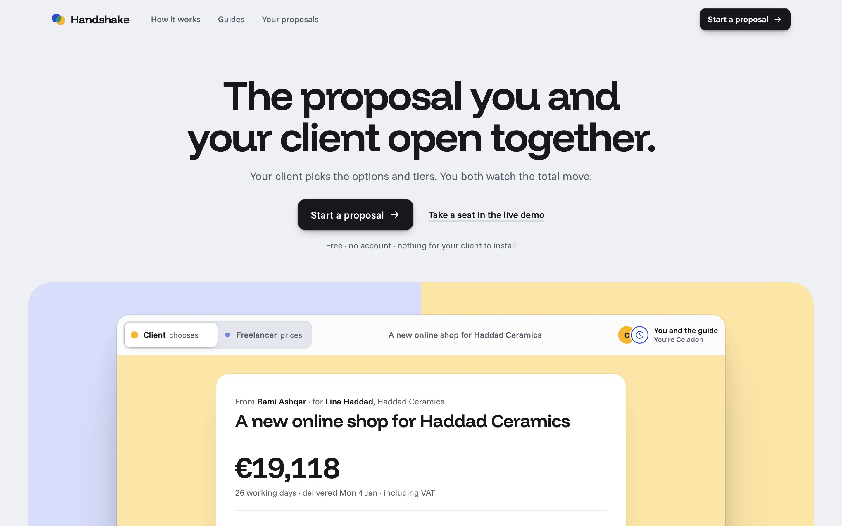
In one line
A proposal the freelancer and the client open at the same time: the client switches the work on and off, the price and the delivery date follow for both, every change is on the record, and accepting freezes a version.
The short version
I shipped Handshake on 18 October with engineering I’d still defend: server-ordered ops, an offline queue, revisions, a hashed acceptance. The next day I opened it as a first-time user and got lost. The sync was right and the product was unusable. The review that passed it had scored how it looked, not whether a person could do the job.
So I rebuilt it twice, keeping the engine both times. The first rebuild (19 October) fixed the tasks: which side you’re on, where Share is, how a line opens. The second (24 October) fixed the feel: a native-app world in the Things / Craft / Arc tradition, and a landing page that is itself a live room, where everyone reading the page is in one proposal together. This is the story of both.
The brief (to myself)
Ease and Meridian are single screens with no server, no saved state and no forms. Clients who need an app, a dashboard or an admin panel see nothing that looks like their project. This one had to be an app: a server, real-time sync, forms, data and every state designed. And it had to stand out in a crowded category (PandaDoc, Qwilr, Bonsai) through a point of view and the engineering, not a feature list.
The point of view: proposal tools treat the quote as a PDF you send and wait on. Here the quote is one live document both people are in, and the record of how it got to “yes” is part of the document.
v1: right engine, lost user
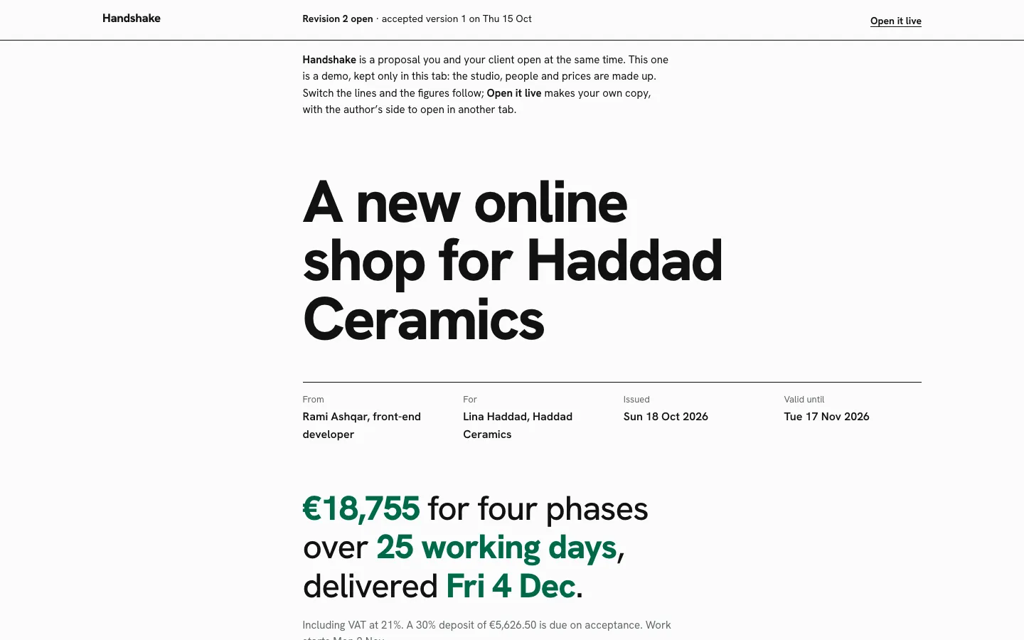
v1 shipped on 2026-10-18 in an “annual report” world: coated white, black ink, one spot green, phase numbers on full-width green fields. It passed its finish review. When I used it cold, five things stopped me:
- The demo opened in its hardest state. The home page landed on revision 2 of an already accepted proposal: comparison columns, revision notes and a record, before you knew what a proposal here even was.
- Nothing said which side you were on. The editor was styled as the client’s document, on purpose. In practice you couldn’t tell whether you were the author or the client.
- “Open it live” seemed to do nothing. It made a real copy and handed you the author’s side to open in another tab. On screen, nothing visible happened.
- Every line showed every control. Kind, quantity, Up, Down and Remove sat under every line at once, so a four-phase proposal read as a wall of controls.
- The important things were in fine print. Share and the edit link sat in small type at the top, and your own proposals were buried under the demo.
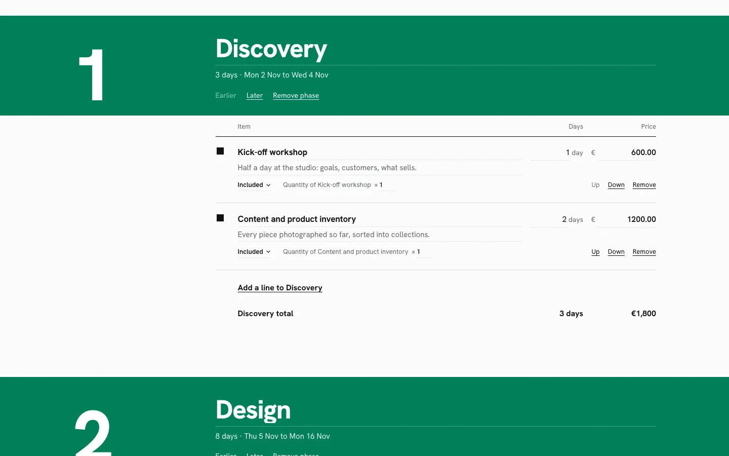
The diagnosis: the review scored visuals, not tasks
The v1 finish review checked the build against its design contract: the type, the spot colour, no cards or pills, the print sheet. It passed on those terms. It never asked whether a first-time visitor could start a proposal, send it, and tell which side they were on. Every failure above is a task failure, and none of them shows up when you grade screens.
So the fix had two parts: rebuild the surfaces around the jobs people come to do, and change the review so it can’t pass a build that fails those jobs.
What stayed, what went
- Stayed, through both rebuilds: the whole core. The ops, the room, the sync client, totals, timeline, revisions, the record and the acceptance hash were untouched, apart from starter proposals and one wording fix in the record (“Mara switched on Journal” rather than “added”, which read as if the client wrote content).
- Went: two visual worlds (the v1 annual report, then the Shared Canvas), their stylesheets, and the page components that were really layout. The statement, record, acceptance, revision, field and title components were kept and restyled each time.
- Proposals made before either rebuild open in the new pages unchanged.
First rebuild: the tasks (19 October)
The first rebuild was about jobs, not looks. Its world was a “Shared Canvas” borrowed from design tools: a dot grid, the proposal as one frame on it, each person in their own colour with a named cursor. Most of what it introduced survives into the current version:
- A role bar on every proposal page. The first thing on the page says who you are: “You’re editing. Lina sees each change as you make it.” for the author; the freelancer’s name and “choose your options, then accept” for the client. The author’s Share and Preview as client are always one click away.
- Lines open in place. A line reads as a plain row until you select it, then opens right there with its fields and a small toolbar. One line at a time; Escape closes it. The details, the letter and the terms work the same way.
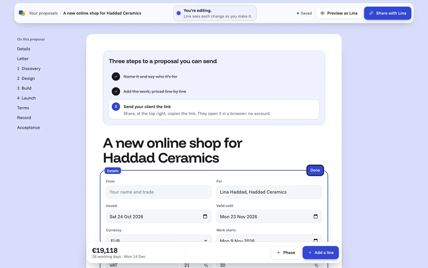
- A blank proposal tells you what to do. A three-step checklist inside the sheet (name it, add priced lines, share the link) ticks itself as you go. No tour, no modal.
- A front door. Three guides, each ending on a starter proposal you copy into the editor;
/newand/proposals; server-rendered copy and structured data.
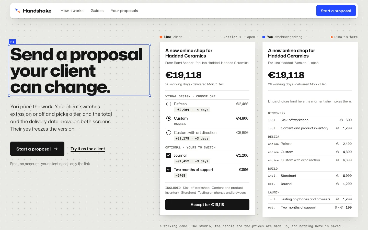
It worked, and it still looked like a design tool wearing a proposal. The canvas, the selection handles and the redlines were borrowed grammar; the product had no look of its own.
Second rebuild: the Shared Desk (24 October)
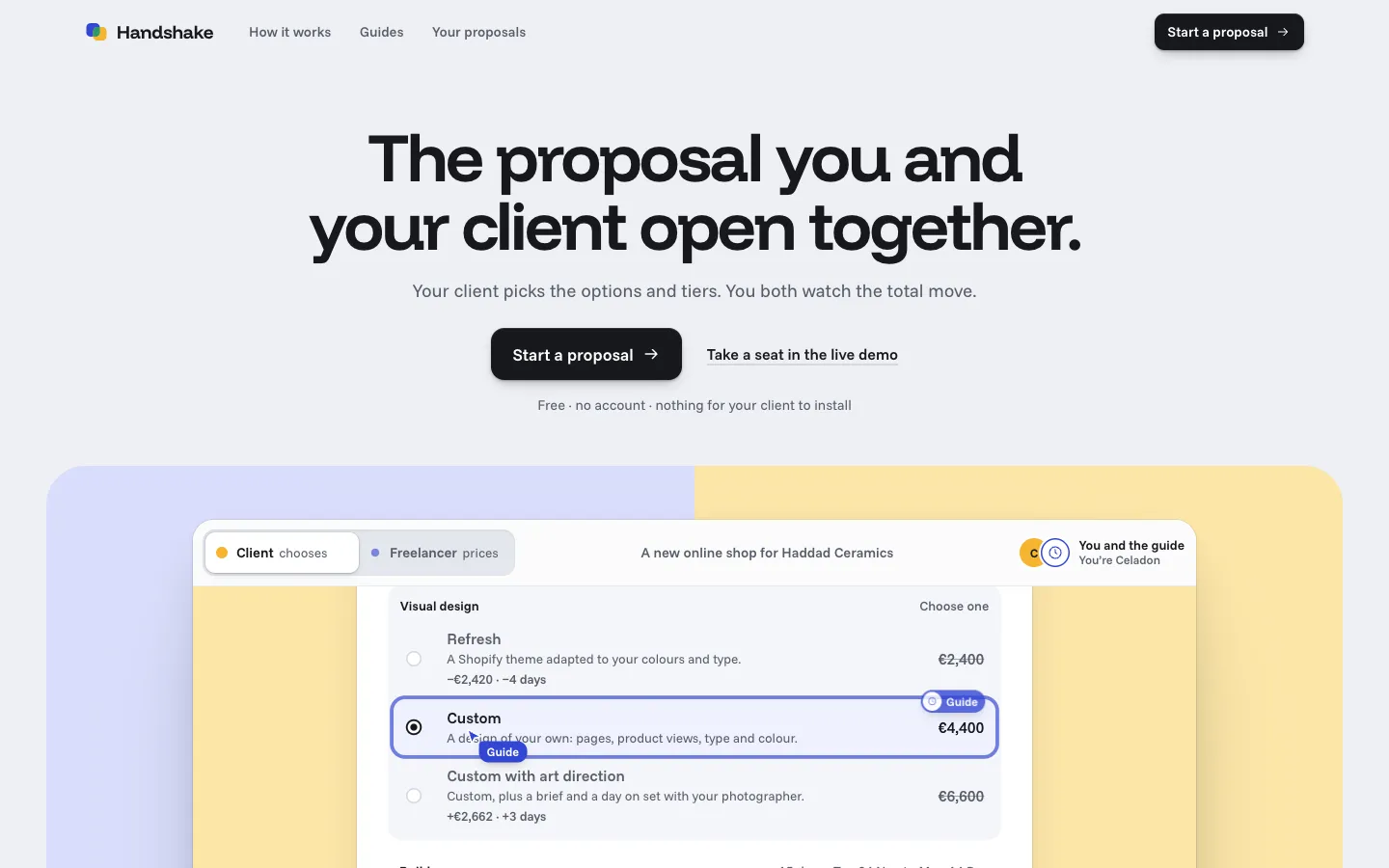
The brief for the second pass was “premium”, and the reference that settled it was MarkLayer’s landing page, which is itself a live room: you arrive and other people are already in it. Out of a direction round I picked the native-app tradition of Things, Craft and Arc: a finely made app where two people sit at one sheet.
The world
- Desk and sheets. A cool desk grey with white sheets on it, 20px corners and layered soft shadows. No dot grid, no frames-on-a-canvas.
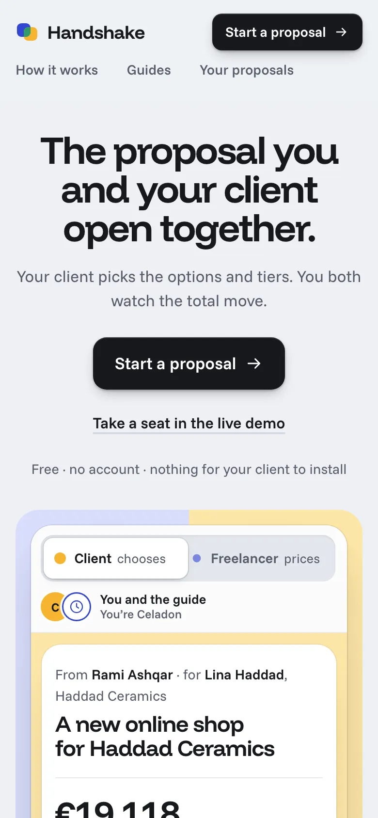
- Each seat owns a colour space. The freelancer is cobalt on periwinkle; the client is marigold on butter, with ink on it, never white. A proposal page takes the viewer’s colour as its field, so you know your side before you read a word. A frozen version sits on plain desk grey.
- Green only where the two overlap. Agreement is drawn as the two colours overlapping, in the mark, the accepted record and the logo. Green appears nowhere else.
- Funnel Display and Funnel Sans. Display for headlines and figures, Sans for everything else, on an eight-step type scale.
- Controls you can feel. Switches, radio rows and the seat switch move on short springs; totals roll digit by digit in the direction they moved. Everything settles to still under reduced motion.
The landing page is a live room
Everyone reading the home page is in one demo proposal at the same time, through the real sync engine.
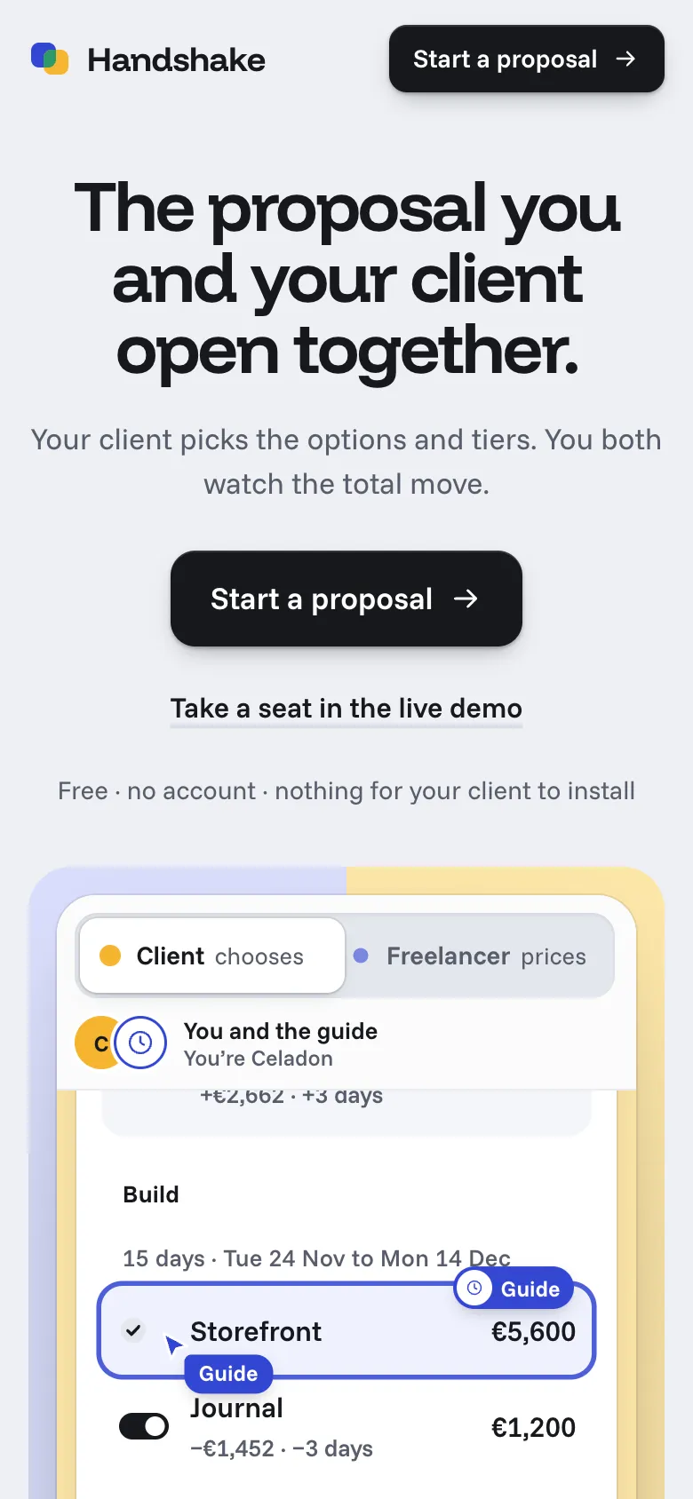
- Take a seat. A Client / Freelancer switch in the window’s title bar. Other visitors appear as round avatars and cursors with names, anchored to the line they point at, so a cursor stays on “Journal” whatever the other person’s screen size.
- Never an empty room. When you’re alone, an automated guide, labelled as one, plays the other seat: it points at a line, then changes it. The window scrolls to follow it, and the change lands with the guide’s colour ring on the row and the total rolling.
- Safe with strangers. Nobody types free text into it. The client seat switches lines, picks tiers and accepts under the name the room gave it (glaze names: Celadon, Shino, Tenmoku), so a visitor’s name can never be mistaken for a real person’s. The freelancer seat changes prices and estimates and adds or removes three ready-made lines. The room resets every hour, takes at most 40 people, and falls back to a private copy in the browser when it is full or unreachable.
- Below it, the old way set as an email thread, three steps with small working vignettes, what the record and versions guarantee (each promise shown beside the real artefact: the price chip, the moving date, the fingerprint, the revision tag), guides, questions.
Proposal pages
- A toolbar that names your seat (“You’re editing” or “Proposal from Rami, for you”), who’s here as avatars, the save state, and for the author Preview and Share.
- The total at display scale. “€19,118”, then “For four phases over 26 working days, delivered Mon 14 Dec.” The figure is the heaviest thing on the sheet.
- A dock at the bottom keeps the rolling total, the days and the date in reach, with “Add a line” for the author or “Accept for €19,118” for the client.
- The other person’s changes land in their colour, with their name on the row and in the dock, and the record lights the line in the colour of whoever made it.
The reviews, rebuilt around tasks
After v1, every finish review judged first-time task completion as well as visuals: can you tell which side you’re on, start a proposal, edit a line, share it, preview it, accept it.
First rebuild
- Round one: “fix”, with eight items. The editor opened on a form rather than the document; the Included mark looked like a checkbox; kicker labels; a truncated title; a generic engineering section; guides that didn’t end on their starter; unclear copy; and no capture of an open line to check against.
- All eight were applied. That’s where the details, letter and terms became set text that opens in place.
- Round two: two verdict passes, the second ending “ship”.
Second rebuild
- Round one: “fix”, with eight items.
- The live room’s signature was claimed in text but never visible: no capture showed a cursor or a ringed row.
- The proposal total was a sentence, not a figure.
- The record said “The author” where the client should read “Your freelancer”.
- The hero lede ran three lines.
- The guarantees were a list of icon tiles, the template the brief refused; they became specimens of the real artefacts.
- Loose spacing around “Change my choices”.
- An unreadable button label in a vignette, caused by a selector that outranked it.
- Twenty-six font sizes, which became eight.
- Two verdict passes. The first scored six of the eight resolved; the cursor fix and the author’s own record wording were still partial. The second, after both were fixed, ended “ship”.
What it does
- Read the deal at a glance. “€19,118” at display scale, then “For four phases over 26 working days, delivered Mon 14 Dec.”
- See what a choice costs before you make it. Each option carries a chip with what it would do to the total and the days: “Total +€1,452 · +3 days”. Line prices are before VAT and the total includes it, and the page says so beside the total.
- Watch it move for both people. The author sees the client’s choices arrive in the editor; the client sees the author’s edits arrive in the document, each in that person’s colour, with presence as avatars and in words (“Lina is here”).
- Accept by typing a name, then confirming a summary of what’s in and out, the tax, the deposit and the dates. The room freezes the version with the time and a SHA-256 fingerprint of its contents: “a record of acceptance, not a legal e-signature”. Then the client is told what happens next.
- Revise after acceptance. Any change opens revision N+1. The client sees notes on each line (“Was €3,600”), removed lines struck in place, and the accepted version beside the revision. An accepted version is locked behind “Change my choices”, and each one keeps its own printable page.
- Read the record. It starts when the proposal is shared; the author’s drafting stays out of it. Then every change is a plain line with its time and what it did to the total: “Lina switched off Journal, −€1,452”. A line about a line or a phase takes you to it and rings it.
- Lose nothing offline. Edits made with no connection are kept in the browser, survive closing the tab, and arrive once when you are back.
- Print it. Only the sheet prints, on white, to clean A4 or Letter pages with their own margins; the desk, toolbars, dock and authoring tools don’t.
Key engineering decisions
- Server-ordered ops, not a CRDT.
- Each proposal is one SQLite-backed Durable Object. Browsers send typed ops; the room checks the role, validates, applies, numbers and logs each one, then broadcasts it. The echo is the sender’s confirmation.
- The browser applies its own ops at once and replays the ones still pending on top of every confirmed state, so a slow round trip never shows.
- Roles split the document (the author edits, the client chooses and accepts), so real conflicts are rare by design, and field-level last-writer-wins is enough. A CRDT would have been a project of its own for a problem the roles already remove.
- The sync is plain code, tested as plain code.
- The rules (
Room,SyncClient, the ops, totals, timeline, record, diff) live insrc/corewith no platform code. The Durable Object only stores and moves messages. - A seeded network simulation runs three tabs through 200 random sessions: interleavings, disconnects, reloads, catch-up from a snapshot, random accepts. After the network goes quiet, every tab must hold exactly the room’s document and the room’s log.
- The key tests were checked by planting bugs (a client confirming with its own clock, dedupe switched off) and watching them fail.
- This is what made two rebuilds cheap to do safely: every screen was replaced twice and the core’s tests didn’t move.
- The rules (
- Acceptance accepts what you saw. The accept op carries a hash of the content the client was looking at. If the author changed a price while the client was typing their name, the room refuses the acceptance and the page says so. The hash is a SHA-256 written out in TypeScript, because
applyOpis synchronous and has to agree in the Durable Object, the browser and the tests; WebCrypto is async. - Nothing lost, nothing doubled.
- Every op has an id that is unique across tabs. The room drops a resend it has already applied, by id, and answers with an ack.
- Pending ops are saved per tab in localStorage. The next page for the same proposal takes them over, so a closed tab or a reload loses nothing; a queue taken from a tab that is still open is harmless, because the room dedupes. Acceptances are never replayed from storage.
- Reconnects ask for the ops since the last seen sequence number, or get a snapshot when they are too far behind; backoff runs from 0.5 to 8 seconds with jitter.
- The record can say what an op can’t. After
item.remove, the item’s name is gone. So the room writes a note on each op as it applies it: the totals before and after, the version, and the name of what changed. The page folds runs of edits by one person to one field into one line with the net change. - The demo is the real engine, shared. The landing page’s room is one more Durable Object (
DemoRoom) running the sameRoomandSyncClientas every proposal. What makes it safe for strangers lives insrc/core/demo-room.tsas plain, tested rules: which ops each seat may send, the room-given names, the three ready-made lines, and the guide’s scripts. The guide is server-side, driven by the Durable Object’s alarm, so every visitor sees the same guide and it costs nothing when the room is empty. Pointers are anchored to a line (item:storefront, plus a position inside it), not to screen coordinates, so a cursor lands on the same line on a phone and on a 27-inch screen. - Starters are fresh proposals, not templates. A starter is a version 1 copied from a worked example: no history, no demo label, “from” left blank, the middle tier picked.
createProposaltakes a starter id. - Server-rendered, then live. The client view renders on the server from the Durable Object, so it paints at once and has a proper title; the socket then catches up from the rendered sequence number. Links get forwarded, so the Open Graph preview shows the title and nothing else, never prices or names.
- Capability links, no accounts. The client link is a 128-bit random id. The edit link carries a key in the URL fragment, so it never reaches a server log or a Referer header; only its hash is stored. Edit links are kept on the device and listed at
/proposals.
Hardening
- Turnstile and a per-address limit on creating a proposal; a per-address message limit on the socket that closes with “try again later”, so the browser backs off and resends rather than losing an edit.
- At most 20 connections per proposal, 200 lines and 64 kB of content per document, frames over 100 kB refused.
- A Durable Object alarm deletes a proposal 90 days after its last change; the page says so, and the rule is a tested pure function.
- The live room takes at most 40 people, no free text, and only the ops its seat allows; it resets every hour and falls back to a copy in the browser when full or unreachable. Pointer messages are thinned on the server rather than counted against the message limit.
- Every control is at least 44px tall. Totals and the other person’s changes are announced politely without moving focus; text edits on one side don’t flood a screen reader on the other. Springs, rolling digits and gliding cursors all settle to still under reduced motion. axe-core reports no WCAG 2.1 AA violations on any page type.
An audit after launch
Three weeks after the Shared Desk shipped, I audited it the way a stranger would use it. I tried it at laptop and phone sizes, keyboard only, under reduced motion, with axe, and with bad input: commas, huge numbers, letters, empty names, long titles. I looked at every control in each of its states, and I asked what the product should let you do that it didn’t. axe was still clean and every switch read clearly on and off. The problems were in the money and the edges. Eleven of them:
- A price that saved on one screen only. Typing a price over the limit showed it in the editor, but the room refused the message without naming the change. The change waited forever: the editor said “Saving…” and showed a total of €121 billion, while the client saw €19,118. The browser now checks a change against the same rules the room uses before it applies it, and the field says what it accepts.
- “1200,50” became €120,050. The comma was read as a thousands mark, so a decimal comma made the price a hundred times larger, with no warning. A comma with one or two digits after it is now a decimal comma, “1.200,50” works too, and anything ambiguous is refused, not guessed.
- Proposals dated a day off. The server dated new proposals by UTC, so one made after midnight in Amman was issued “yesterday” (and one made in the evening in Los Angeles, “tomorrow”). The browser now sends its own date.
- A chip that didn’t match the prices beside it. Refresh is €2,400 and Custom €4,800, but the chip said “−€2,904”, because it counts VAT and the line prices don’t. The chips now say “Total”, and the note under the total says line prices are before VAT.
- The edit link fell out of the address bar. The outline and the skip link were plain
#links, and the edit link keeps its key in the fragment. Clicking “Terms” replaced the key, so a reload lost the editor. In-page links now scroll and move focus without touching the address. - “From —”. The first-run checklist ticked “Name it” without your own name, so a proposal could go out from nobody, with a blank avatar in the client’s bar. The step now asks for it, and an unnamed person’s avatar shows a person, not an empty disc.
- The client read “The author is editing this”. It now says “Your freelancer”.
- “Connecting” on first load was set in alert red, as if something had gone wrong.
- On phones the site’s nav was hidden, with no menu, so “Your proposals” was only in the footer. It is now a second row under the wordmark.
- At 360px the live room’s seat switch spilled “prices” off its track.
- The unit tests had a date in them that has since passed, so some failed on
main. The test clock is now pinned. Three browser checks still looked for the first design’s markup; one current script replaces them.
The record already knew which line each change was about, and the page couldn’t use that. Now it can: “Lina switched off Journal” is a link, and following it scrolls to Journal and rings it.
A second audit: the flow between the pieces
A second pass walked the whole path, from a new proposal to sharing, the client’s view and acceptance, at laptop and phone sizes. The pieces held up. What was missing was the flow between them. Twelve findings; the ones that mattered:
- No draft. The client link was live from the first second, and the record logged every setup step. A client read “Rami changed the title” and “Rami renamed the tax” before a single choice. A proposal is now a draft until the link first goes out: the author copies it, or it is opened on a device that didn’t make it. The record starts there, with “Rami shared the proposal” or “Lina opened the proposal” and the total at that moment. Drafting is one new op, so the room still orders everything and the tests cover it.
- Nothing checked a proposal before it went out. One was accepted with no start date, no terms and no letter, and the client read a note meant for the author: “Dates follow once a start date is set”. The Share panel now lists what’s still missing, each item a link to its field. It never blocks sharing.
- Accepting was one Enter press. Typing a name now shows a summary first: what’s in, what’s switched off, tax, deposit, dates. If the proposal changes while the client reads it, nothing is sent and the summary updates. Afterwards the client sees what happens next: the deposit, the start, that Handshake sends no email, how to keep a copy. The top of the proposal now says “Accepted”.
- The author couldn’t see where things stood. Your proposals listed titles and dates. Each row now says draft, waiting for Lina, revision 2 waiting, or accepted by Lina on 18 Nov, with the total.
- The dock covered what you were typing. “Add a line” put the new field under the floating dock. A focused field is now scrolled clear of it, and the dock’s button says where it adds: “Add a line to Build”.
- Clicking “Tax” and typing “VAT” gave “TaxVAT”, which the client then saw. Numbers and that default now select themselves when you click in.
- On phones the header stayed pinned and took a quarter of the screen, and the landing demo was a box that caught the swipe meant for the page. The header now scrolls away (the dock keeps the connection status), and the demo is part of the page.
- An optional line that was off showed its price struck through, which reads as a discount. It is now just dimmed. After acceptance, lines print as in or out instead of switches that look usable.
- Two identical “Accept for €…” buttons showed at once; the dock’s steps aside by the form. A line made optional now starts on, so the total doesn’t drop as you pick it. The demo’s guide slows down after its first pass, so the record doesn’t fill with the same three switches.
Bugs worth telling
- A product that passed review and failed its first user. The biggest bug in v1 wasn’t in the code. See the diagnosis above.
- Acceptance numbers that didn’t converge. The room stamps an acceptance with its own clock. A client that confirmed the op with the browser’s clock held a different document from everyone else. The simulation caught it once acceptances joined it.
- A test that passed for the wrong reason. “Doesn’t apply twice across a reload” passed with dedupe switched off, because the echo still arrived before the reload. Planting the bug showed it; the test now really loses the echo.
- Re-picking what was picked opened a revision. Switching off a line that was already off by default stored a new value and looked like a change. Revisions and fingerprints now compare the content as the client sees it.
- A room where nobody saw anyone. The cursors worked in testing and never showed up in screenshots. The server broadcast a pointer only at the moment it moved and kept no positions, so anyone who arrived between moves saw an empty room. It now remembers the last position for each person and sends them to everyone who joins.
- A total that only one person saw. The room checks every message against a schema and drops one that fails, without naming the change in it, because a malformed message has no trustworthy id. The browser only checked that a change applied, not that it passed the schema, so an over-limit price became a change the room would never confirm. The fix is small: the browser runs the room’s own check first, including on changes a closed tab left queued. A test plants the over-limit price and fails without it.
- A share panel that vanished in Safari. Content blockers hide elements by class name, and
.share-panelwas on their list. The classes are nowhandoff-*, andshare-*/social-*names are banned in this codebase. - An unknown id stored data. In the spike, any probe of a random id created tables. Tables are now created only by
create, and an unknown id gets a socket that closes with 4404 so the browser stops retrying.
Cut (deliberately)
Accounts, email sending, payments, a legal e-signature, rich text, comments on lines, undo, a template library beyond the guides’ starters, logos, AI writing, analytics, and a source link.
What I’d take from it
- Grade tasks, not screens. A finish review now has to walk the first-time path and say where a person would stop.
- Keep the core separate and tested. Replacing every screen was safe because none of the rules lived in them.
- Open the demo on the simplest true state. The hardest state shows off the engine and loses the visitor.
- A demo with other people in it says “real-time” better than any copy. If nobody is there, bring a guide and label it as one.
What could come next
- Comments on lines, the first thing a real client would ask for.
- “Revert this change” from the record, in place of multiplayer undo.
Numbers
- 99 unit tests, including 200 seeded multi-tab sync sessions with reloads and acceptances, and the live room’s rules.
- One Durable Object per proposal plus one for the live room; nothing else stores data. No D1, no KV.
- Two typefaces (Funnel Display, Funnel Sans), two seats’ colours, green only where they meet, eight type sizes.
- Three visual worlds in one week; one engine.